Alrighty, then!
When last we spent time in the studio, things were off to a good start. This piece has sort of evolved like a trilogy: The first steps set the tone and set our adventurer on their way. In the second act things got... messy.
I mean, the printing went okay, as you'll see. But keeping up with the documentation didn't. Oops. There were a few little fussy steps that happened with no witnesses but me...
 |
| Linocut in progress: Steps 3.1, 3.2, 3.2 and 4.... printed in secret, apparently |
These missing steps were mostly about the bird's head, and were done with spot inking and masks, as with the very first step.
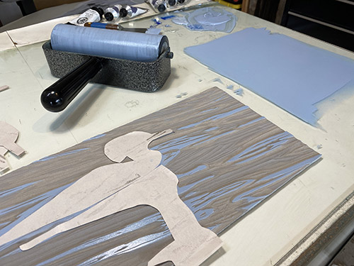
Step 3.1 was the soft green on the back of the bird's head.
Step 3.2 was the bright yellow of the beak.
Step 3.3 was the shadow on the side of the head and neck
And then there was Step 4, which I think was another blended roll of blues, but apparently I took no photo of the rollup. Probably because I was just so happy to be done with the little tedious bits and wanted to charge on ahead to something more satisfying.
But we did get back on track with documentation for Step 5:
 |
| Step 5 rollup |
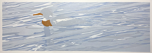
Look at those blues, will ya? On the block they look rather alarmingly bright, but printed they feel...
Well.
Hm.
Kind of bright. (Although this is a pretty awful photo. There has been a lot of photography on rainy days lately.)
 |
| Step 5 printed |
So, okay. Things here look bright, but there IS a method to my madness. Mostly. A lot of this blue is going to be covered by some very different hues, and I wanted to be certain the blues that remained would be able to hold their own. You'll see what I mean with Step 6:
 |
| Step 6 rollup |
Yeah, WHAT? What is this all about?
Well.... the bird is swimming in shallow water near the shore, which is why it's so choppy. I wanted to add some depth to the image, plus suggest the rocks that can be seen (sort of) below the surface of the water. Visually they look like dark greeny-browny shapes... rather nebulous, but they are creating the pattern of the water as much as being a part of it. I don't think I can literally represent the rocks without adding a significant number of intermediate steps to the process, but I want to suggest them.
My hope was that the ochre color across the top would create some yummy greens, and that the greeny-browny color in the lower 2/3 of the image would interact in interesting ways to create some more blues and greens in the foreground.
 |
| Step 6 printed |
And surprise! It worked! (I bet you thought I was out of my mind. No problem. I did, too.)
It's coming together nicely now and I am fairly certain it can be finished in maybe 3 more color passes. But you know how that goes!
And now, as a bit of an aside:
Those of you who followed along with my recent problems of chromatic shifting of inks mixed with a lot of transparent base might be wondering what I'm up to here, because it certainly seems like there is transparency going on in this piece!
There is, although not nearly in the proportions I used to use. In this last step the ochre was rather more opaque than usual, which you can see because the resulting color after printing is still very warm and yellowish. The dark color was created with a mix of sepia ink and... wait for it... Payne's gray ink. Payne's gray is not a color I ever used when I was doing more painting, but both this color and the sepia are "semi-transparent" right out of the tube. I still wanted the color a little more transparent, so to be safe I pulled out my last half-used tube of Daniel Smith transparent extender, which is resin-based rather than linseed oil-based. I didn't use a lot of it, but it helped.
Wait? Did I say Daniel Smith ink?
Yes. Yes I did. I still have a small stash that I have been hoarding in the what? ten-plus years? since Daniel Smith abandoned their huge printmaking customer base and stopped manufacturing ink. Am I still bitter about that? Yes. Yes I am. Don't get me started.
I still haven't found a long term solution to the transparency issue... I might try again with the Graphic Chemical 1911 base that I used for the last... I dunno... 15 years? (I never like the DS transparent base... it was too sticky. But somehow ten years of sitting around has made it a bit better to work with.) I had trouble with a couple of batches of the GC 1911 arriving here discolored and already hardening in the can, which is what forced my shift to Cranfield in the first place. Until I have another solution, I'm learning to work in a new way, with a much smaller percentage of base, or none at all.